
How do you critique other people's data visualizations? Here's a framework to consider!
|
Hey folks! I’m in proposal writing mode again. Unfortunately, I am finding my weekly search for a data visualization to share with you is leading me down unproductive internet rabbit holes. So, I thought I’d share an idea with you that I hope resonates. If you have any reactions, please send them my way! For the past year or so I have been recreating other people’s data visualizations in an attempt to learn new techniques with R and expand the type of data that I normally visualize. The idea for this came from talking with my artist son who introduced me to the concept of a “master copy”. If you ever go into an art museum, you might notice people sitting with a pad trying to recreate something they see. By copying a “master” they try to figure out how to create a desired effect. I don’t know about you all, but I have definitely learned far more R over the past year than I would have if I had only made the plots I needed for my research. I have also planted numerous “seeds” in my imagination that I can call upon when I need to make a creative visualization for my research. But, the technical skill of generating a plot is only part of the work required to make the plot. The technical skill is only a small part of the overall process. I could draw a plot on a paper towel and give it to someone to create for me. I worry that we spend so much time worrying about how to make a plot in whatever software that we forget to worry about if it is even the right plot to make. I’ve seen some pretty awesome plots made in Excel and some wretched plots made in R. Something I have noticed is that we are very reluctant to critique other people’s work. Frankly, this is why I make a lot of plots from the media and not science. I know that most of the plots we see in papers are generated by trainees and I’d never want to “punch down” at someone who is still learning their craft. I suppose I consider someone at the NY Times to be an anonymous professional that can take my criticisms. I think it is critical that we learn to critique each other’s plots! But how do we do this without punching down? How do we build each other up by giving feedback? I think this is where art has something else to teach us. Art has a robust culture of criticism. Note that “criticism” isn’t like your parents asking why you only got a 98% on a test rather than a 100%. It’s more of taking apart the process and the symbolism to come up with an assessment of something. Too often we think of criticism like the overbearing, perfectionist, helicopter parent. We pound out criticism in a comment box without thinking. What if there was a better way? I would love to talk to people about their and my own data visualization choices and process. I think I’d grow as someone that works with data. We’d share the limitations we had imposed upon us either by the experiments, the data, or our technical skills. We’d share the question we were trying to answer with our data. We’d get other ideas that we could try to incorporate in refactoring the plot being critiqued or when we encounter a similar type of data or question in the future. Isn’t this how good mentors help trainees with their writing? I try to read a draft without forming any initial opinions other than asking what the author is trying to tell me. Then I think about what is getting in the way. I’ll identify a few examples that I point out to the author and say, “Here are a few things I want you to address. These are just examples with some thoughts on how you might fix them. I see the same type of issue elsewhere in the manuscript so see if you can find them yourself and create your own remedy.” That’s the ideal. Can you see how that would help someone grow in their writing skills? I hate using track changes on initial drafts of a manuscript. Why? Well it’s everything the previous paragraph is not! When I use track changes I basically rewrite the text with no feedback to the author. They’re left with a bunch of red and blue markups and little context for what I did. We have no problem critiquing writing, but for some reason we do with visualizations. So what can we learn from art criticism? In my reading, there are four steps to a critique: description, analysis, interpretation, and judgement. Here’s an example of a teacher giving a critique of Van Gogh’s “Starry Night”. The Kennedy Center also has a nice outline of how to give a critique. Allow me to briefly adapt the Kennedy Center outline to think about how to critique data visualizations. Where I have included quotes I directly lifted the text from the Kennedy Center resource: 1. Description (“Describe the work without using value words such as ‘beautiful’ or ‘ugly’”)
2. Analysis (“Describe how the work is organized as a complete composition”)
3. Interpretation (“Describe how the work makes you think or feel”)
4. Judgement (“Present your opinion of the work’s success or failure”)
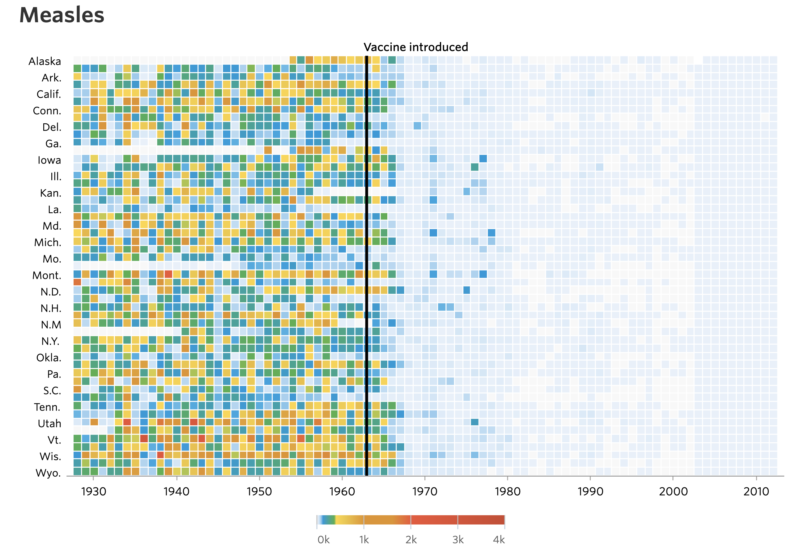
There are a couple of things to notice about this outline. First, not all questions are equally relevant. For example, I don’t care so much that the plot is original if it effectively answers the question. Second, we need to develop empathy for the designer. Someone could be amazing at data visualization and still face constraints. For example, not being able to present data on a log scale to a lay audience is going to be a constraint if one really needs to use a log scale. Third, related to the last example, we need to think about the context the data are being presented in. We have all been in a seminar where the presenter says, “I know you can’t read this but…” Ok, maybe I’ve even said that. But this is often a product of taking a visualization from one context like a paper that I can zoom in on and plopping the same visual into PowerPoint. Those are different media targeted to different audiences (typically seminars are full of more generalists and papers are read by specialists). The level of detail and composition of the visual will need to be different. Here’s a plot that I thought was really cool when it came out. It was published in the Wall Street Journal. See if you can apply the critique outline to this visual.
Again, let me know what you think of the issue of critique. What was your conversation like? Talking with my artist son about this, he emphasized that everyone really needs to be more receptive of criticism and we need to be better at seeking it out.Hey folks!
|
Riffomonas Professional Development
Hey folks, Earlier this week, those of us in the US celebrated Memorial Day. For many, this marks the unofficial start of summer. I suppose the clock is now ticking until Labor Day, which is the unofficial end of summer. Let me be the jerk to tell you that you have 100 days left to accomplish all of your summer goals. I suspect that for many of you writing papers and putting together conference posters and talks are on your list of goals. Generating attractive visualizations of your data is...
Hey folks, I’ve been getting asked to give more talks about data visualization and my experiences critiquing visualization. It’s been a lot of fun to engage with live audiences. I enjoy learning about their experiences, motivations, and limitations. As much as I love this newsletter and the content I post to YouTube, it’s clear that it isn’t a substitute to talking to people without the filter of email or a chat box. So, if you’re interested in working with me on an individual or group level...
Hey folks, The more I peruse the literature, the more I see that researchers need help designing figures to help tell their stories. I don’t just mean the mechanics of creating a figure in R, Python, Prism, or Excel. Rather, if someone had a box of dry erase markers of various colors and they had to give a talk without any slides, what would they draw to tell their story? I don’t mean to trivialize the difficulties. It’s hard! There are many figures I’ve published that I wish I could have a...